How a storefront is put together
Services and groups, the three panes of the editor, and how cards are arranged on the page.
A storefront is a page of cards. Each card is called a widget, and there are exactly two kinds:
- A service — one thing a guest can order. It has a price, a picture and a detail page of its own.
- A group — a section that holds other cards. A guest taps it and lands on the cards inside; it has no price and can't be ordered.
That is the whole vocabulary. A small storefront can be five services and no groups at all. A large one is usually a handful of groups — Spa, Dining, Excursions — each holding its services, so the first screen a guest sees stays short.
The three panes
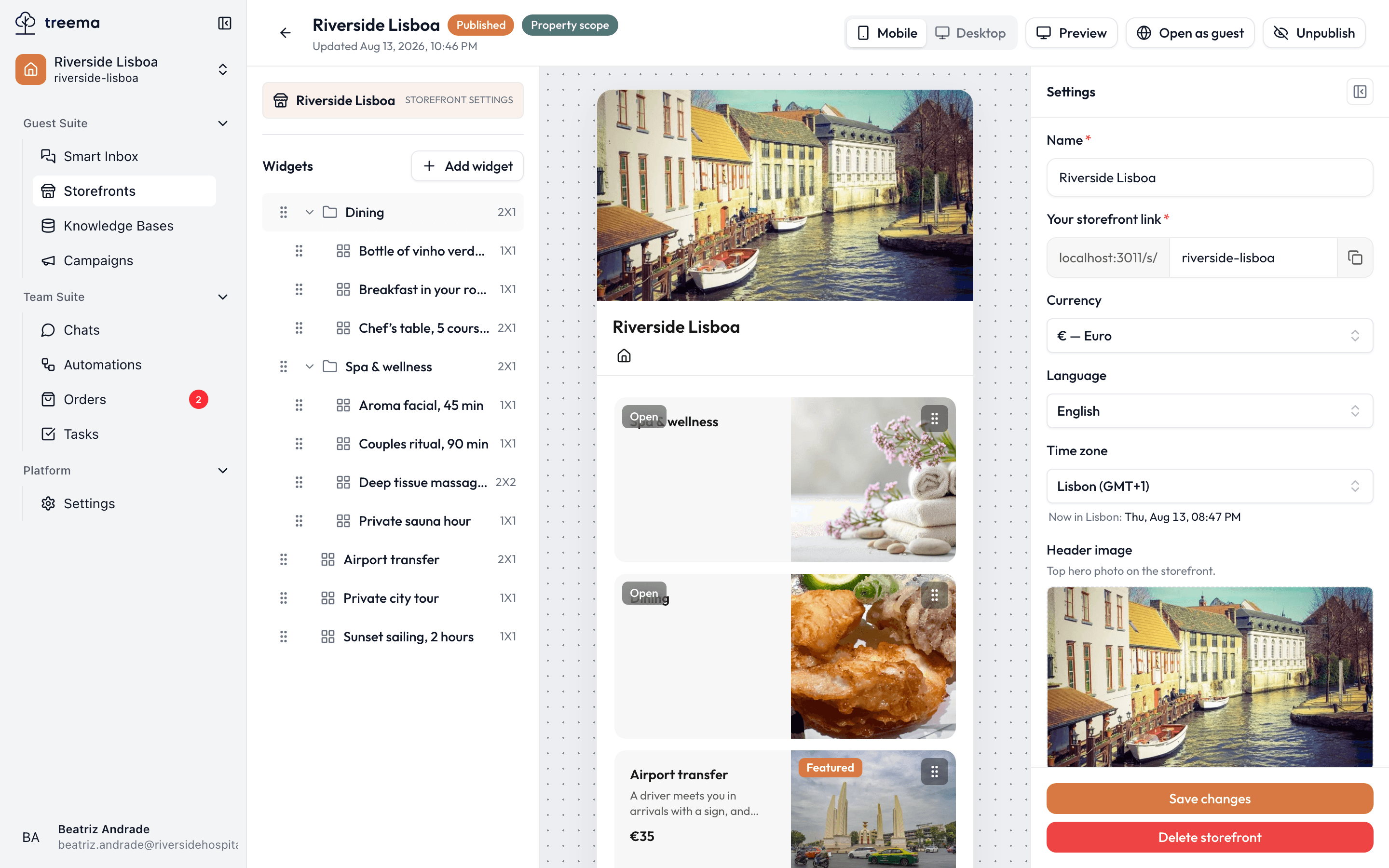
- 1
- 2
- 3
- 4
- Device switch, Preview, Open as guest, and Publish
- Every card, nested the way a guest will find it
- The page, one level at a time
- The Inspector — the selected card, or the storefront’s settings
The middle pane is the real page
What you see in the middle is not an approximation of the guest's page — it is the page, drawn the same way it will be drawn for them. If it looks right here, it looks right to a guest.
Left — what's on the storefront. At the top, Storefront settings: the name, the link, the currency, the images. Below it, Widgets: every card, nested the way it will be nested for the guest. This is the structural view — the fastest way to find a card in a storefront with fifty of them.
Middle — the page. The storefront as a guest gets it, one level at a time: the top level first, and a group's contents once you open it. Clicking a card here selects it, exactly like clicking it in the list on the left.
Right — the Inspector. Everything about the selected card, or the storefront's own settings when nothing is selected. The button in its corner folds it out of the way when you want the page wider; the strip it leaves behind brings it back.
Above all three: Mobile / Desktop, which redraws the middle pane at that shape. Guests mostly arrive from a phone, so the editor opens on Mobile — but do check Desktop before you publish, because a page that reads beautifully in one column can look sparse in four.
Adding a card
A new element is added with the Add widget button above the list, which offers a choice of type — Service or Group. The new card is created at the level of the hierarchy you are currently in, after which the Inspector opens on it so that a name can be entered.
Full information about a service card — text, price, photographs, badges — is set out on the service card page.
Arranging the page
Cards are moved in two different ways, depending on the job in hand.
1. Changing the structure — the left pane. The list on the left is where the hierarchy is edited. Dragging a card by its handle changes the order it appears in; dropping a card onto a group places it inside that group. A group with contents has an arrow for expanding and collapsing it and a Move in button, which opens the group's contents in the middle pane for further work inside it. To take a card back out of a group, drag it onto the Drop to root level area at the top. A move that is not allowed is refused, with the hint "Cannot drop here".
2. Setting the layout — the middle pane. The middle of the page is where the visual arrangement of the cards is changed. Dragging a card by its handle changes its position. Card size is not changed by dragging — that is set in the Size field of the Inspector. Each card occupies a whole number of grid cells according to the size set:
| Size | Shape |
|---|---|
| 1 x 1 | A square — the default, and what most services should be. |
| 2 x 1 | Twice as wide as it is tall — a banner across the page. |
| 1 x 2 | Tall and narrow. |
| 2 x 2 | A big square. Use it sparingly, on the thing you most want ordered. |
The grid is four columns wide on a desktop and two on a phone, so a 2 x 1 card fills half a desktop row and the whole width of a phone screen.
One difference between the two panes is worth knowing before it surprises you: while you're building, cards stay where you put them, gaps and all. On the guest's page they close up — cards pack towards the top with no holes between them. If you left a deliberate gap, the guest won't see it.
A group with no elements in it displays a message saying so, which keeps it from being read as a broken state.
Copying and removing cards
The top of the Inspector holds a Duplicate button, which creates a full copy of the card with every setting it has. This is the quickest way to create new services from existing ones — a fourth massage treatment out of the third, say.
The Delete button at the bottom of the Inspector asks for confirmation before it acts. Deleting a group deletes everything nested inside it as well — the confirmation dialogue names the card being deleted and warns that its contents will go with it. Anything that should be kept is best moved out of the group first.
Checking your work
- Preview, in the top bar, opens the storefront in a new tab with the editor's own elements stripped away.
- Open as guest goes to the current public version of the page. The button only becomes active once the storefront is published; until then it explains why it is not.
Where to go next
- The service card — every field on a service, and what each one does to the page.
- Asking the guest for details — the extra questions attached to an order.